Monday, April 8, 2013

Yen Yen everywhere, nobody to spend?


In a last ditch effort to fight prolonged recession, BoJ finally launched the much anticipated unlimited QE. In short, the policy focuses on keep pumping the money until the inflation doesn’t reach the target level of 2%. Though the decision remains well debated in financial media, whether it would be successful or not, remains yet to be seen. Yen, nevertheless, clearly weakened as a result of this. Perhaps one may always argue that weakened yen is always good for an export dependent economy (like Japan) but the transmission mechanism is not simple to comprehend. Especially in the context of ongoing currency wars where any act of currency weakening is quickly responded.
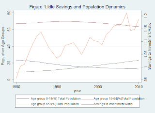
Despite above arguments, the key to growth remains consumption. Japan’s case is also special in respect that Japan is gradually becoming a nation of elderly. Panel 1 presents the dynamics of population in Japan.  Here the population is distributed into three major catagories 1) Childern (0-14 Years) Working pool (15-65 Years) and the elderly (65+ years). It is clearly visible that the share of elderly is on the rise while the working age population is shrinking. In addition, the share of newborns has also fallen. What seems more worrisome is that the gap between the outflow from the working (65+ year) pool and inflow to working pool (0-14 years) has turned negative for women much earlier than men. This not only has implications for labor markets but also for the ability to replenish the national labor pool. The portion of fertile women (proxies from age distribution) has fallen significantly. If kept unchecked, sooner or later it would start to drag the male labor pool as well.
Furthermore, in order to check the trends in saving, I calculated the savings to investment ratio for the country. The higher the ratio, the less the conversion of savings into investment (i.e. more idle/unproductive) savings. Interestingly, the ratio has been consistently rising over the time (Figure 1). This means that Japanese are saving more but investing less. This can be proved theoretically since the trade off between the future consumption (savings) and current consumption is determined by interest rate (for detailed understanding of the concept please see Prof, S K Chug’s notes here). However, since the real interest rates are positive not because of positive nominal interest rate (which requires investment of money) but negative inflation (which doesn’t require investment of money) it may very well be possible that Japanese population would be indifferent between cash savings and not the investment. Furthermore, it can also be argued that since the average age of Japanese population is increasing, thus it may also be possible that lack of investment has to do something with that. Whatsoever the reason may be, apparently Japanese are saving more and investing less.
To investigate the matter further, I took the Japanese household expenditure data (2 or more members in the household) from December-December basis (available here). Panel 2 represents the trends across categories of expenditure. Interestingly, trends in most of the expenses were either stagnant or decreasing. Furthermore, I also categorized the expenditure in inelastic (necessary expenditures) and elastic expenditure and plotted them over time (Panel 3).Interestingly, not only elastic expenditures but also inelastic expenditures have shown a decreasing trend. This also indicates that Japanese are not only saving more, but also spending less. To further investigate whether ageing had to do anything with spending I plotted the proxy of population replenishment gap (The gap between the 0-14 and 65+ years old population over time) and then plotted them against both elastic as well as inelastic expenditures (Panel 4). The results turned out to be pretty interesting. While the elastic expenditures decrease alongside the increasing gap (which is understandable), it appears that the increasing gap has also started to affect the fixed expenses as well. As the gap was reducing (in positive territory), the fixed expenditures were increasing but as soon as the gap started to turn negative (sometime around 1996-1997), the fixed expenditures have also started to fall. This means that as more and more population becomes aged, the deflation spiral is going to be prolonged, something which can’t be countered by just increasing money supply.

Japan's problem is not that it lack's money. Its problem is that it lacks people who would spend that money.

A Note on Reproducibility:
Author considers reproducibility as an essential tool for acceptability, improvement and propagation of understanding. The code and data file can be downloaded from links provided below. (Programmed in STATA)
Acknowledgements:
I owe an intellectual debt to Dr. Farooq Pasha (A good friend and my instructor in Macro-Economics) and Dr.Sanjay K Chug (For his generosity by making his lectures available on net)    
(The blog-post and code-file are the intellectual properties of author. The material can be used for all legal and valid purposes with proper referencing.)

Appendix:


Tuesday, April 2, 2013

Fed: A Story of Success and Failure?


Hi folks, it’s good to be back again. A change in job and hectic study schedule has proven too much for me recently. But nevertheless, the germs of curiosity in my blood have kept me motivated for searching and analyzing data (a thing I’m crazy about).

While Federal Reserves (Fed) and other central banks have faced a diversity of opinions (both positive as well as negative), one thing can be said with fair amount of certainty. The central bank has been broadly successful in arresting the escalation of crisis, (if not helping recovery). Even Ben reiterated on several occasions that the current crisis was indeed a novel yet challenging experience for the policymakers (including the central banks). However, despite fiscal constraints in place -amid fiscal cliff fiasco- fed has to undertake the risky yet uncertain task of simulating the crisis ridden economy. While overall picture may not be as impressive as one could hope, but there are certainly some bright spots for which Fed deserves its due share of appreciation.

Let me start up by a simple concept that why fed needed to act when the economy was dwindling. As the economic activity contracted, so the prices started to cool down. Now though a common man would love to see the prices fall (since it increases his real income), a consistent fall of prices is as equally dangerous for an economy as a consistent rapid increase (aka hyperinflation). On the face of it this looks quite disturbing -since the deflation has a positive effect on consumer’s welfare- yet a deflation spiral is as dangerous for the general economy as hyperinflation. And yes we do have living examples of both phenomenon. If the examples of hyperinflation include Germany, Russia and more recently Zimbabwe. Japan serves as the classical example of a deflation spiral where consistently falling prices can cause an economic limbo. How does that work? It’s quite simple. The spending and saving decisions of economic agents are inter-temporal (though Stochasticity is also an important component but it’s less relevant to current discussion). This means that economic decisions are not only motivated by current state of affairs but also the expectations. So if expectations change, the optimal mix of saving consumption decision changes.  Thus, if an average economic agent expects that the prices are going to be lower in the subsequent period, he will postpone his consumption. Resultantly, the aggregate demand will shrink, resulting in further deflation and market surpluses. The producers don’t like surpluses, so the aggregate supply curve would shrink resultantly, bringing economy to lower output (GDP) level. And this spiral would turn vicious if the deflation expectations are not combated by appropriate policy mix.

Here I have put forth some data analysis of inflation expectations using data from Bloomberg and FRED to understand whether Fed’s achievements are confirmed  empirically. The data consists of monthly observations from Jan-05 to Nov-12 (95 Obs) for a generalized index of inflation expectations (U Michigan Inflation Expectations) , data for short and long term Nominal Rates (2Y,10Y) –intentionally skipped 5Y- and their respective breakeven –another proxy for market inflation expectations- I also included the data for avg weekly labor hours and overtime for analyzing the implications of Fed’s policies on Labor market.

Question 1: Does implied inflation necessarily reflects the general inflation?
Well since the participants in financial markets are believed to behave in a similar way as the economic agents in the general economy, it can be implied that the expectations revealed by the investors in financial markets should be similar to the latent preferences in the general economy. Here is a graph showing relationship between U Michigan IE  and 2 Year BE. Figure 0A reveals a strong relationship between general inflation expectations and BE. However, the analysis through time –Figure 0B- reveals that BE is a more sensitive and volatile measure than the general inflation expectations. This makes intuitive sense since the participants in the financial markets adjust more rapidly to new inflation expectations than the general economy.

Question 2: Was Fed able to successfully combat the deflation spiral?
 A close analysis of Figure 1 reveals that though the inflation expectations fell sharply amid the financial meltdown. Fed’s QE program (Especially QE2) was able to restore the inflation expectations to pre-crisis levels, successfully evading the dangerous deflation spiral (though deleveraging impact undermined the importance and success of restoration of inflation expectations). So Fed does deserve the credit for not allowing US economy to slip into Japan-type economic limbo.

Question 3: Was the introduction of O-Twist and QE3 a good decision?
Well Fed can be allowed benefit of the doubt since the macroeconomic picture was 1)Desperate 2)Complex. However, Figure 3A suggests that inflation expectations were pretty much averaged along the long term mean and became more well behaved. Furthermore, Figure 3B indicates a decoupling between the longer term nominal interest rates and Breakeven. This effectively means promotion of a wealth destruction effect for the longer term. In fact, it was post QE2 that the decoupling effect became more prominent. Thus if Fed continues to encourage wealth destruction, agents would tend to rebalance their portfolios by either 1) Seeking insurance in TIPS 2) Spending (which Fed Wants them to do)  3)shifting to the shorter end of the curve being risk averse. Thus, except scenario 2 Fed’s policy -of promoting lower long-term lending rates- would be undermined as long term funds market may face a shrinkage of supply. Yet one thing that goes to Fed’s advantage is that the long term inflation expectations are fairly upward sticky (Figure 2).

Question 4: What are the implications for Labor Markets?
Since Fed operates with dual mandate (inflation and employment), it is also crucial to see if Fed’s actions may have a significant effect on the labor market.
Figures 4A, 4B and 4C plot the average weekly over-time and labor-hours against inflation expectations against both short and the long term inflation expectations. What’s more interesting to note is that the short term inflation expectations actually drive the dynamics of the labor market. The average amount of labor and overtime supplied tend to fall as the inflation expectations exceed around 3.5%. However, the long term inflation expectations don’t have any negative impact on the labor market. Thus this leaves us with two arguments 1) Fed can employ as much OT as it wants in the Longer-end of the yield curve because it doesn’t impact the labor dynamics or 2) Fed is targeting the wrong expectations since the bulk of the labor market is driven by more volatile short term inflation expectations.

Its getting 2:23 in the night and I have a training to attend at 8PM so I would call this a day. However, I’ve uploaded both the data as well as the code file (do file). Feel free to extend the analysis and correct me if I have got it wrong somewhere. Here's the link
https://www.dropbox.com/sh/xmzz7h533zzv3e3/H1dfc1v5jR

(This material (blogpost and codefile) is the intellectual property of the author. It can be used for all legal and valid purposes given the original source is properly acknowledged.) 

Appendix:
(Note: Pictures get messed up as I upload them. However, they are appropriately numbered so you shouldn't find it much difficult to figure out which figure belongs where)